
Data Visualization of Irani Cafés
Data Visualization | Duration: 2 weeks
UX
Solo Project
a tag
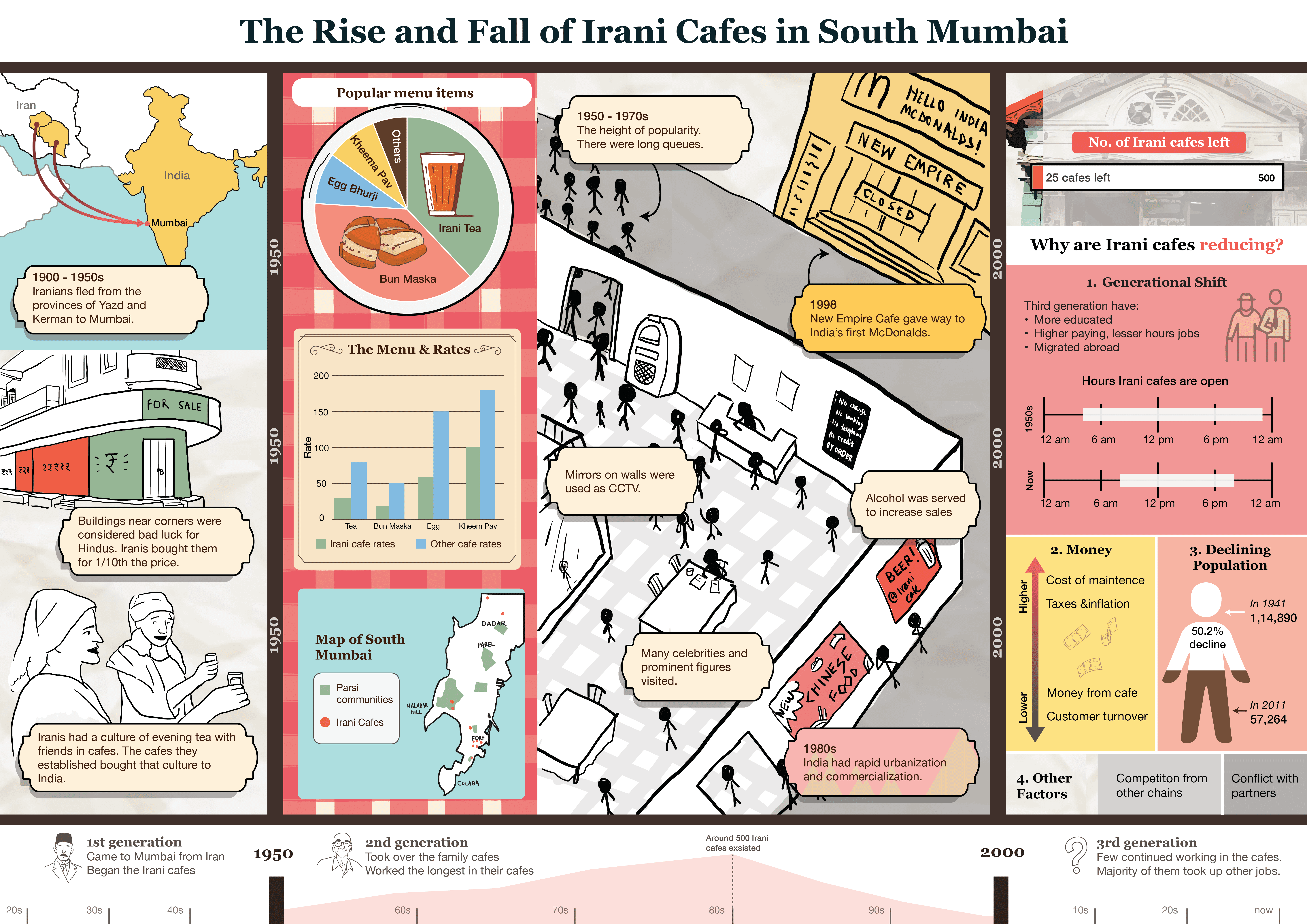
Overview
I learnt how to create and leverage data visualizations effectively to deliver clear narratives and easy understanding to the user by creating a poster showcasing the rise and fall of Irani cafes in South Mumbai, based on field research and secondary data collection.
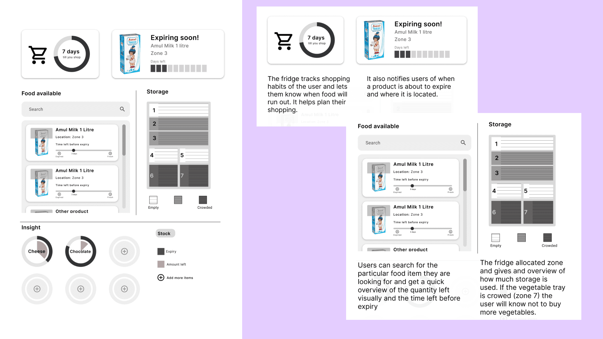
Understanding Data Visualization
To understand data visualization more effectively we were asked to create a hypothetical dashboard. The dashboard presented here, represent the display on the door of a smart fridge. Meant for Indian households, where the fridge tends to be packed, with the idea of helping them better organize. It scans the items and tracks the shopping habits of the house and notifies about expiring goods. (mock up of fridge panel)
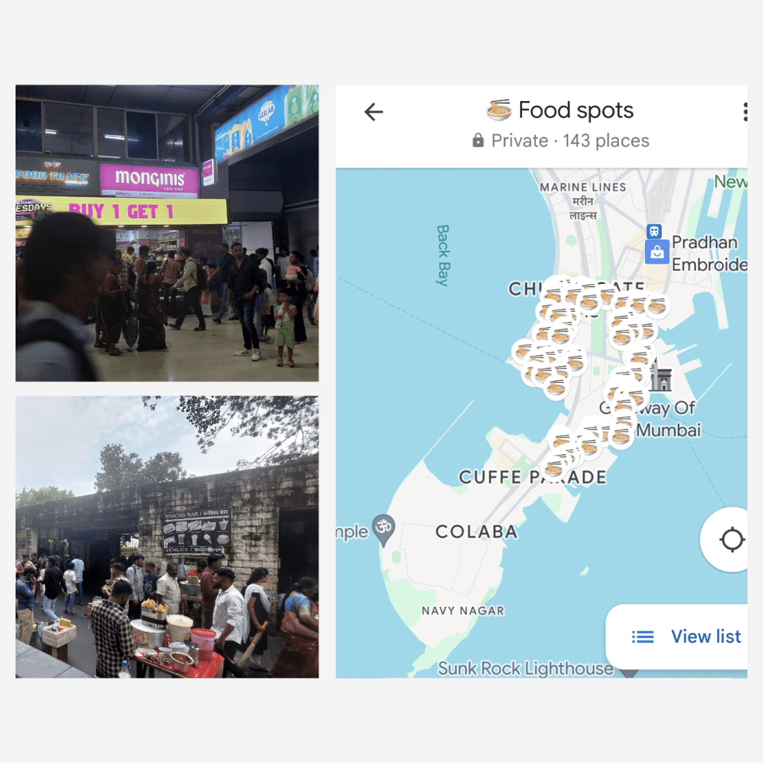
Data Collection
I started my research by collecting information about eateries in South Mumbai (Colaba). I noticed that there was a drop in the number of Irani cafes in the area and conducted secondary research (news, research papers, articles) as to understand why.
(add rough sketches)
Synthesizing and Ideating
On synthesizing the data it became evident that the shifts of the Irani community itself caused the decline of the cafes. Most of the data I was able to collect was on the qualitative side. I had to think of an alternative way of visualizing the data and focused more on the visual narrative aspect.
(add rough sketches)

The What
How the visualization might be made interactive. (Please use mouse clicks to navigate)